


%20(1).png)
Mother of the Bride Dress Colors to Avoid (and What to Choose Instead)
- bridalandformalbou
- 7 days ago
- 6 min read
Choosing a dress for your mom can feel overwhelming, especially if you want her dress to coordinate with the wedding palette while showing her personal style. The color you choose will affect how she looks in photos and the overall aesthetic of the wedding. Many brides are unsure which shades are flattering, which ones to avoid, and how to balance personal style with tradition. That’s where understanding mother of bride dress colors can make a big difference.
This guide will help you navigate color choices, including shades to skip, options that photograph beautifully, and practical tips for making the decision easier. By the end, you’ll have a clear sense of how to help your mom feel confident, elegant, and perfectly coordinated with your wedding vision.
Why Color Choice Matters for Your Mom
Your mom’s dress is part of the overall wedding aesthetic. While the style and fit are important, the color sets the tone for how she looks in photos, complements your gown, and coordinates with the bridal party. Certain colors can inadvertently draw attention away from the bride, clash with other elements, or appear too casual or formal for your wedding setting.
When thinking about mother of bride dress colors, consider these key factors:
Photography: Some shades reflect light poorly or blend too closely with the bridal gown.
Venue and season: Certain colors work better outdoors or in natural lighting, while others are ideal for indoor, evening celebrations.
Coordination: Your mom’s dress should harmonize with bridesmaids, the groom’s mother, and other family members without being identical.
Comfort and confidence: She should feel beautiful in the color she chooses, which enhances her presence throughout the day.
Helping your mom navigate these considerations ensures her dress enhances both her confidence and the wedding’s overall look.
Colors to Avoid and Why
Certain shades are less ideal for weddings. Here’s a breakdown of colors brides often steer their moms away from:
1. White or Ivory
White, ivory, cream, or other bridal shades should generally be avoided. Even slight variations can appear too similar to your gown, especially in photographs. Light fabrics such as chiffon or satin can reflect sunlight or camera flashes, blending with the bridal palette.
Why it matters: Your mom’s dress is meant to complement your look, not compete with it. White or ivory can unintentionally overshadow or visually merge with your gown.
Alternatives: Champagne, soft taupe, pale gold, dusty rose. These tones provide elegance and lightness without mimicking the bridal color.
2. Colors Too Close to Your Gown
Even if your mom’s dress isn’t pure white, shades that resemble your gown’s undertone can cause a similar issue. For example, if your dress has blush undertones, a pale blush gown for your mom can look too similar in photos, creating confusion in group shots.
Alternatives: Choose complementary shades. For warm undertones in your gown, warm neutrals or soft metallics work well. For cooler tones, muted lavender, slate gray, or navy can provide flattering contrast.
3. Black
Black is classic and sophisticated, but it can feel too severe for light, romantic celebrations. It can also dominate photographs, particularly in daytime or outdoor weddings. However, black works beautifully for evening or formal weddings.
Alternatives: Deep navy, charcoal gray, emerald, or eggplant provide elegance without appearing too heavy or formal. These colors are flattering in photos and pair well with metallic or colorful accessories.
4. Bright Red
Red tends to stand out, which can sometimes overshadow other elements in photos or group shots. Bright red may also clash with your wedding palette if you’re using pastels, neutrals, or muted tones.
Alternatives: Burgundy, wine, or mulberry tones give the richness of red without overwhelming the overall look. These shades also tend to photograph better under different lighting conditions.
5. Neon or Extremely Bright Colors
Neon pinks, lime green, or fluorescent yellow can look out of place in formal wedding settings. They can also create harsh contrasts in photographs and compete with the decor or floral arrangements.
Alternatives: Jewel tones such as sapphire, emerald, amethyst, or deep teal offer vibrancy without overpowering the day’s aesthetic.
6. Busy or Large Patterns
Large prints or high-contrast patterns can dominate your mom’s look and draw attention away from key details of your wedding attire. While some patterns add interest, overly busy designs can clash with your palette or make family photos feel chaotic.
Alternatives: Soft metallic embroidery, delicate lace textures, subtle tone-on-tone prints, or light beading add visual interest without competing with your gown.
Mother of Bride Dress Colors That Work Well
After identifying colors to avoid, it’s helpful to know which shades consistently look elegant, photograph beautifully, and complement a variety of wedding styles.
1. Navy Blue
Navy is universally flattering, works for all seasons, and pairs beautifully with metallic accents. It conveys sophistication while remaining approachable in photos.
2. Champagne
Champagne offers a soft glow and works in nearly every setting. It pairs beautifully with pastels or jewel tones and is a popular choice for spring and summer weddings.
3. Dusty Rose
Dusty rose and blush shades create a romantic, timeless look. These shades suit garden or outdoor weddings, and they tend to be flattering on a wide range of skin tones.
4. Silver and Gray
Silver, slate gray, and pewter are chic, elegant options for evening weddings. They photograph beautifully under both natural and artificial light and provide a neutral base for accessories.
5. Emerald and Deep Green
Deep green adds richness and depth without being overwhelming. It works particularly well in fall and winter weddings or venues with natural, woodland, or historic themes.
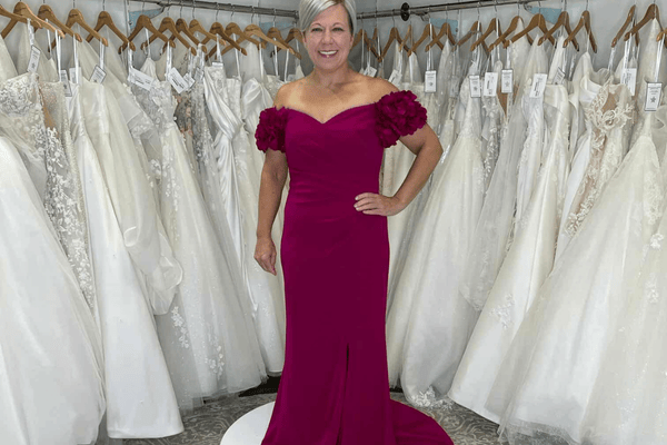
6. Plum, Eggplant, or Berry Tones
Berry tones are flattering and sophisticated. They create warmth and depth in photos and are versatile for both formal and semi-formal weddings.
7. Soft Blue
Dove blue, steel blue, and powdery shades are soft, airy, and romantic. These colors work especially well for spring or summer weddings, particularly outdoor or beach ceremonies.
Tips for Choosing the Right Color
Here’s a step-by-step approach for brides helping their moms select mother of bride dress colors:
1. Start With the Wedding Palette
Use your bridal palette as the foundation. Your mom’s dress should complement, not match exactly. Coordinating shades help create cohesive family photos and a polished aesthetic.
2. Consider the Venue and Season
Outdoor weddings often suit soft or medium shades, while indoor or evening weddings can accommodate richer jewel tones or metallics. For beach or garden weddings, lighter, breezier fabrics and softer colors work best.
3. Coordinate With Other Family Members
Your mom’s dress should complement the mother of the groom and other key family members for balanced group photos. Avoid competing shades or styles that clash visually.
4. Test in Different Lighting
Color can look very different in natural sunlight versus indoor lighting. Encourage your mom to try dresses in similar lighting to what your wedding will have to ensure the shade flatters her and photographs well.
5. Pay Attention to Fabric and Texture
Shimmering fabrics, lace, and subtle beading can enhance or change the perception of color. Two dresses of the same shade may look very different depending on the material.
6. Keep Her Comfort in Mind
Your mom should feel confident in her dress. If she’s uncomfortable with a color, it won’t matter how flattering it is—confidence is the most elegant accessory she can wear.
FAQs About Mother of Bride Dress Colors
Q: Should my mom match the bridesmaids?
A: She should complement them, not match exactly. Coordinating colors ensure family photos look polished without creating confusion.
Q: Can she wear black?
A: Yes, for evening or formal weddings. For soft, daytime celebrations, lighter shades or jewel tones may feel more appropriate.
Q: Are metallics acceptable?
A: Absolutely. Silver, gold, rose gold, and pewter can photograph beautifully and add subtle glamour.
Q: Can she wear two-piece outfits?
A: Yes. A coordinating top and skirt or jacket combination allows flexibility and can be adjusted for comfort and style.
Q: What about short dresses versus floor-length?
A: This depends on the formality of the wedding. Short dresses may work for daytime or semi-formal events, while floor-length gowns suit formal or evening weddings.
Q: How should color change with seasons?
A: Spring and summer weddings favor pastels or soft shades, while fall and winter weddings work well with jewel tones, deep neutrals, or metallics.
Bringing It All Together

Selecting the right mother of bride dress colors doesn’t have to be stressful. At Bridal and Formal Boutique & House of Tux, we help brides and their moms explore gowns and accessories that coordinate beautifully. Our collection includes timeless neutrals, elegant jewel tones, and soft metallics, along with a variety of silhouettes, fabrics, and textures to suit every wedding style.
Book your appointment with us and explore beautiful options with our expert stylists.


Comments